[ 01 ] Profile
Graphic designer, print first.

I am Shae-Lynn, a graphic designer in Toronto. Most of my work is printed: posters, books, magazines and packaging.
I care about the whole job, from the first sketch to the press check: paper stock, ink, finish and how a piece feels in the hand. I also design identities, apps and websites, with the same attention to type and hierarchy.
Every project starts with a point of view. Typography, colour, grid and image give a brand a clear direction.
Get in touchExperience, in short.
Six years in graphic design, most of it in print: magazines, books, posters and packaging, with identity and UI/UX work alongside.
2023 to now
Freelance graphic designer
Toronto, ON
Print, packaging and identity for small brands, publishers and cultural events.
2021 to 2023
Designer
Studio, Toronto
Editorial and packaging design; print production and press checks.
2020 to 2021
Junior designer
Agency, Toronto
Layouts, posters and brand rollouts across print and social.
2016 to 2020
Bachelor of Design, Graphic Design
Toronto, ON
Thesis on typography for small-run print.
Editorial, posters, packaging
Grids, type, prepress
Offset, risograph, screen print, dielines
Brand
Identity systems
Logos, colour, guidelines
Stationery, signage, templates
Digital
UI/UX design
Research, wireframes, prototypes
Design systems and developer handover
Tools
InDesign, Illustrator, Photoshop
Figma
Acrobat prepress, Glyphs
Around the desk.
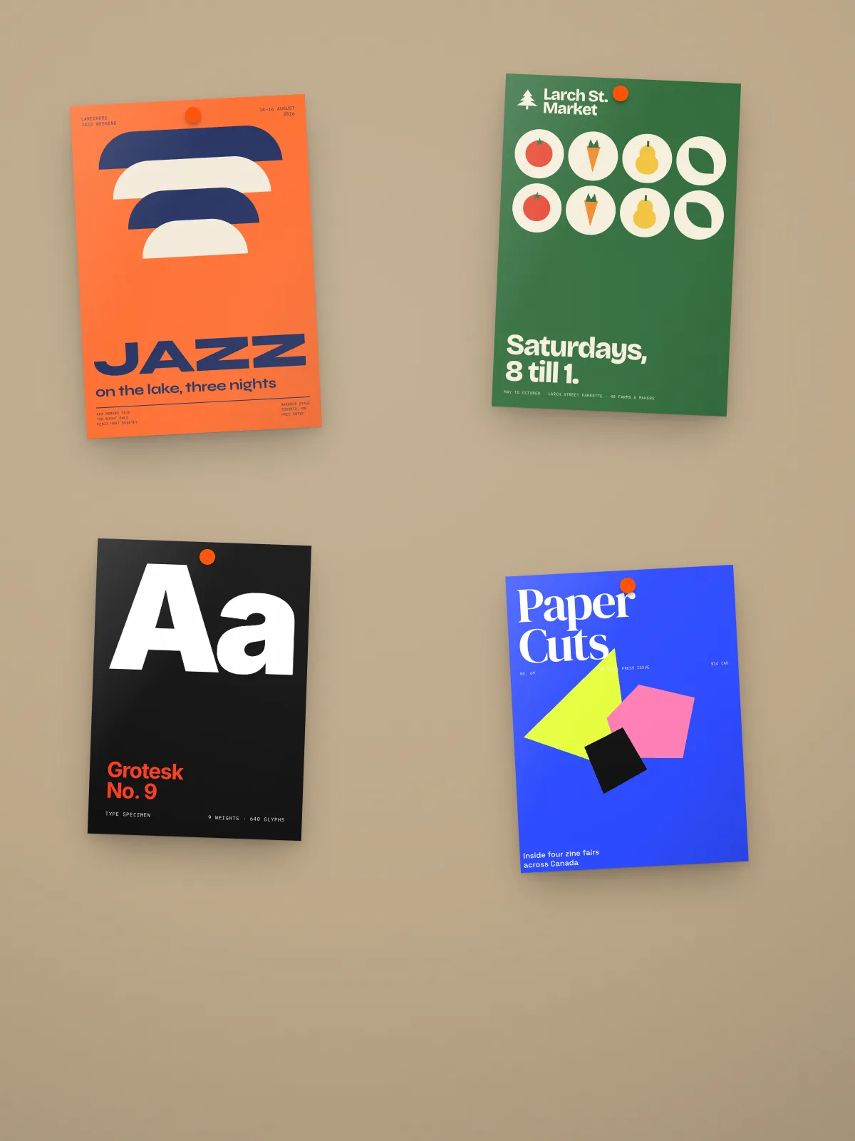
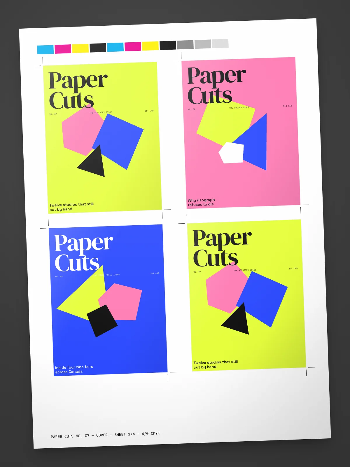
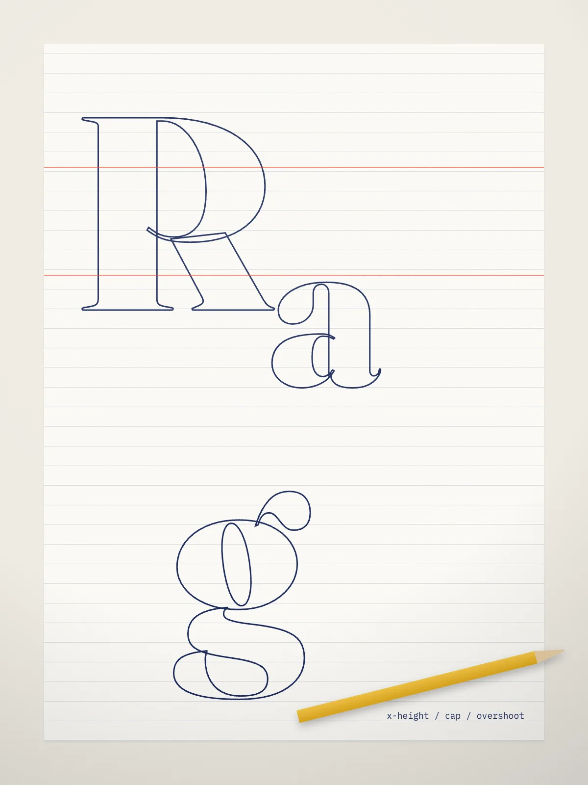
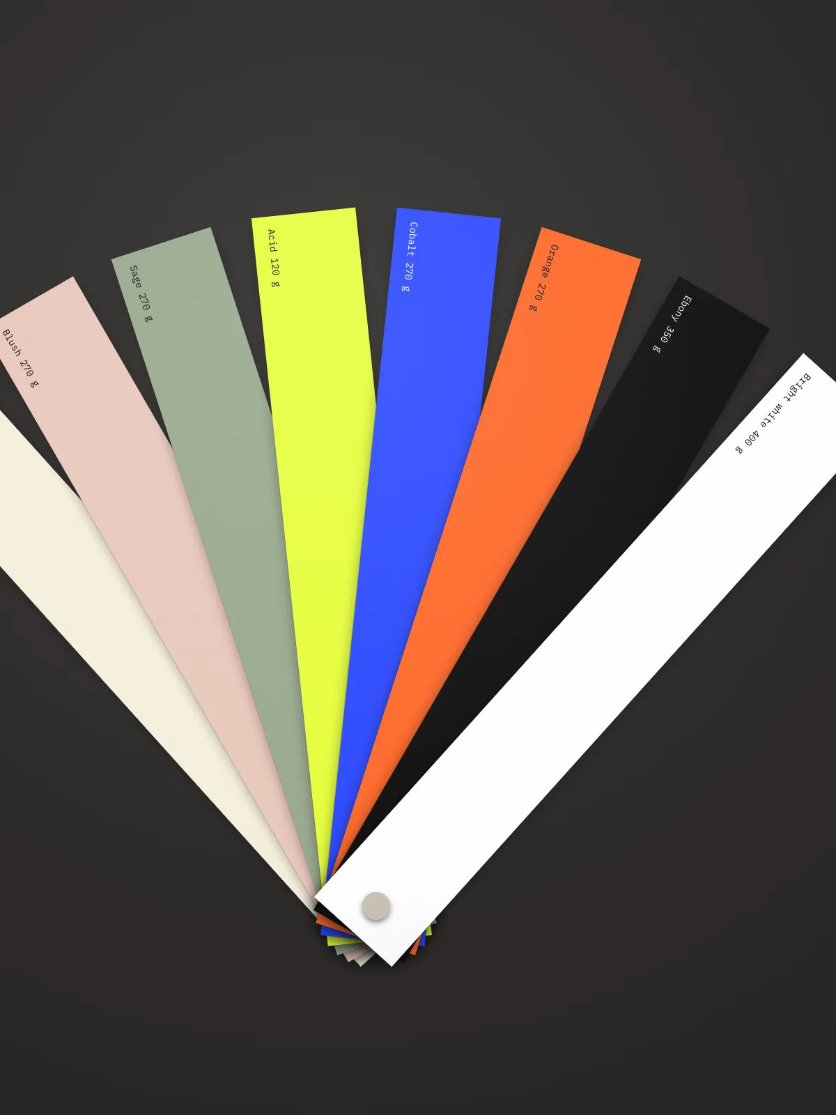
Four rules I keep on every job.
01
One idea first
One clear idea guides the mark, the type and the images. Every touchpoint should carry the same point of view.
02
Every element has a job
A logo, a headline or a single image should carry the idea. Nothing is on the page without a reason.
03
Details do the work
Spacing, kerning and paper stock give design its character. Small details should hold up up close.
04
Work in the open
Share early, take feedback well and keep everyone close to the work, from the first sketch to the final files.
How a project comes together.
A typical six-week print project, from brief to press. Every job sets its own pace.
Typical projectSix weeks
01
Brief
A conversation, the references and one clear brief to work from.
02
Research and moodboard
Two directions, each with a moodboard, type references and early sketches.
03
Identity and type
Mark, typefaces and palette chosen around the idea.
04
Design and layout
Layouts shaped through grid, hierarchy and detail.
05
Refine
A careful round of revisions that keeps type, colour and image consistent.
06
Print and handover
Print-ready files, proofs and a press check, or developer handover for digital work.
Starting point
01
Method
Direction, type choices and design development.
Delivered
Logos, layouts, guidelines and final files for the agreed formats.
Sign off
A clear review before final delivery.
What the work is built on.
Type, colour, grid and image work together. A consistent system carries a brand from a business card to a billboard.
Type with a voice
Typefaces chosen and set to give the brand its tone.
Marks that last
Wordmarks and symbols drawn to work at every size.
A tight palette
A small palette carried through every touchpoint.
Structure first
Grids that keep layouts calm and consistent.
Image direction
Photography and imagery directed to fit the system.
Paper and finish
Stocks, inks and finishes chosen for each piece.
Made for screens
Layouts and marks prepared for web and social.
Built to hand over
Clear guidelines so the brand stays consistent.
How the work connects.
01
Print & editorial
Books, magazines, reports
Toronto
02
Posters & packaging
Screen print to shelf
Toronto
03
Brand identity
Marks and systems
Studio practice
04
UI/UX design
Apps and websites
Remote
A few selected studies.
Ideas I return to.
Studies in type, colour, layout and image. Each explores a different way to build a visual system.
Say helloType study
Letters with character
Independent study
2026
Studio
Colour study
One palette, one idea
Independent study
2026
Studio
Editorial study
The page as a frame
Independent study
2026
Studio
Identity study
Marks with a point of view
Independent study
2026
Studio
One idea should connect the mark, the type and the image. Every touchpoint should carry it.
Shae-Lynn McKenzieGraphic design
Good to know.
What are you looking for?[ 01 ]
A full-time role on an in-house or studio design team in Toronto, ideally with a lot of print. I also take on freelance projects alongside.
Do you work remotely?[ 02 ]
Yes. I am based in Toronto and happy to work on-site, hybrid or remote.
Do you handle print production?[ 03 ]
Yes. I prepare print-ready files, work with printers on stock and finishes, check proofs and go to press checks.
Do you design apps and websites too?[ 04 ]
Yes. Digital is a smaller part of my work, but I take apps and websites from research and wireframes to a finished design system, and work closely with developers.
Are these real client projects?[ 05 ]
The projects shown are concept projects with fictional clients, made to show how I work. Client work can be shared on request.